A major update to the Visual Constructor is released on May 17th.
Was

Past Issues
The following issues existed, that made work in Constructor slower and more difficult.
- Speed of work of the Drag and Drop, on large and complex screens with hundreds of elements.
- Possible visual differences between "Layout edit" (which was an emulator), and resulting in-app view.
- Extra time scrolling the app inside "device frames"
- Inability to quickly view the app filled with data from different users/objects
- Uninformative drag and drop positioning
- Confusing and heavy-looking "Layout Edit", when using lots of long hashtag references
- Difficult to click copy/paste/duplicate/delete menu on complex screens
All solved!
Now
- The engine that runs the Constructor screen has been deeply reengineered:
- the speed of "drag and drop" for even very large screens is now 1-3 seconds
- the view of the screen is now an actual live application, not an emulator
- The visual part is cleaner, more transparent, more flexible in settings and needs less effort during app development:
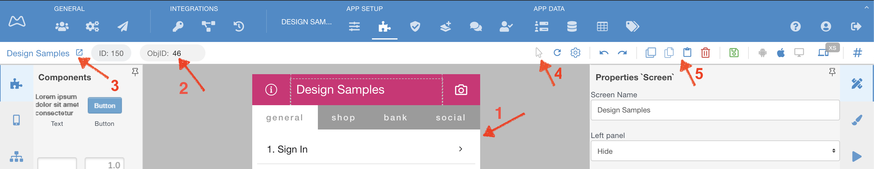
What changed in the overall interface
Corresponds to numbers above ↑
- The "device frames" are deleted, the screen now is a full-screen feed.
- You can change object/user ID on a fly, to see how the app will look with different kind of data
- The screen name, which you edit, now is here and you can open it in a separate window by pressing an arrow
- The switch between "Layout Edit" and "Live Edit" is now a "mouse pointer", meaning you can click through the app
- The panel to Duplicate, Copy/Paste, and Delete a component from the screen is now static, so there is no need to "aim" during clicking
New screen pane manage functions
- You can now select how will the screen look in Drag and Drop (former Layout) mode.
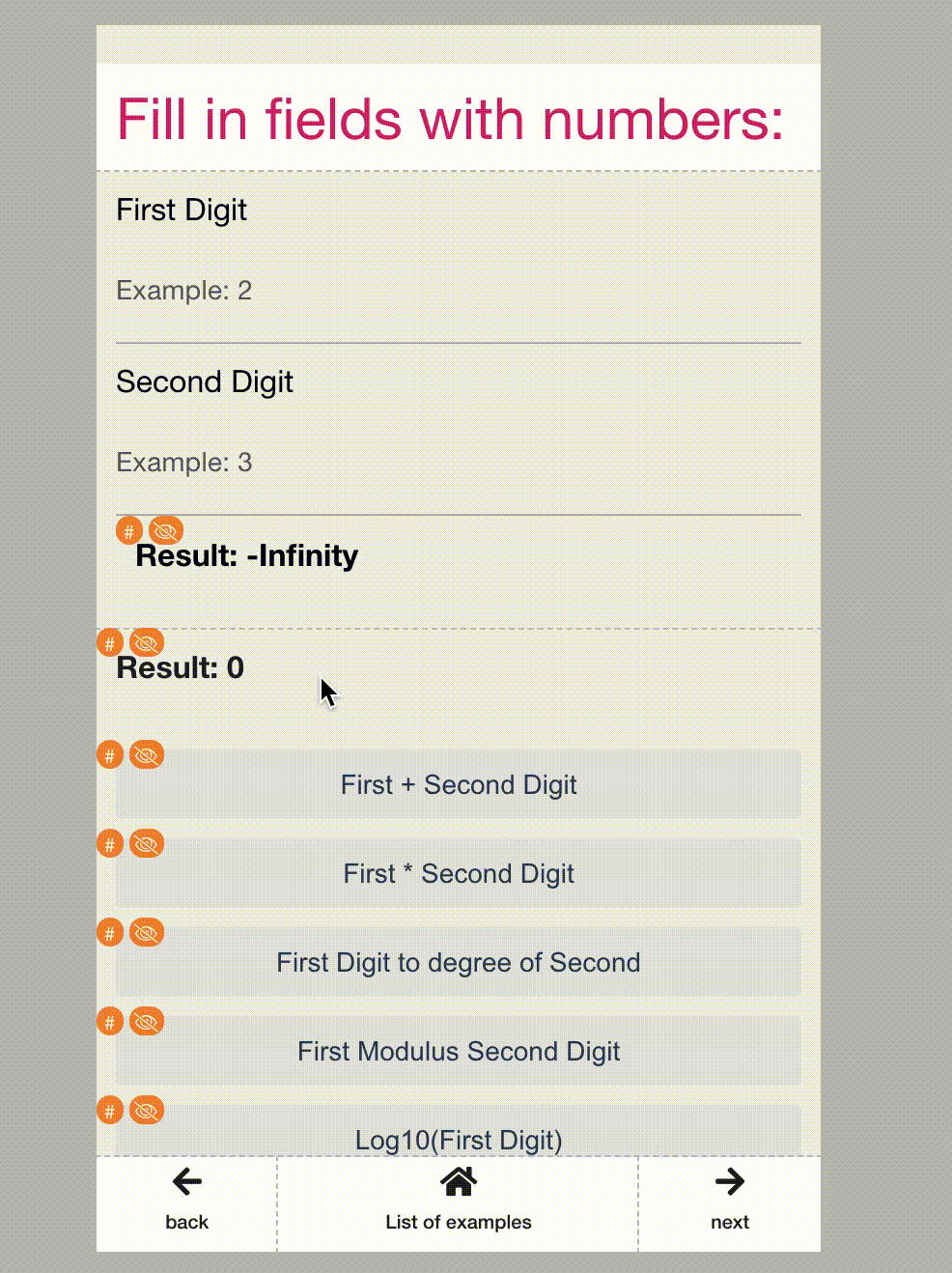
Note the red mark ↓ block from your Demo app's screen called "Math expressions and operations"
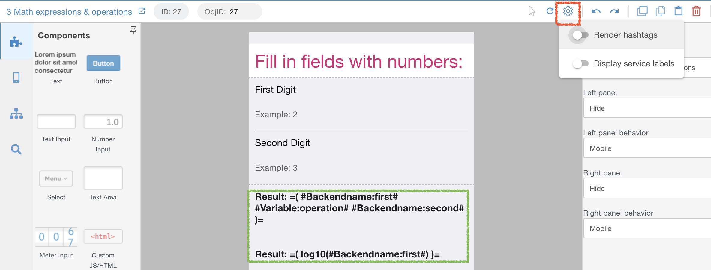
- The previous Layout edit showed these lengthy #hashtags#, note the green marked block ↑
- Now you can "Render hashtags" and continue working with a clean interface, as your users would actually see.
Note 2 amber blocks ↓.
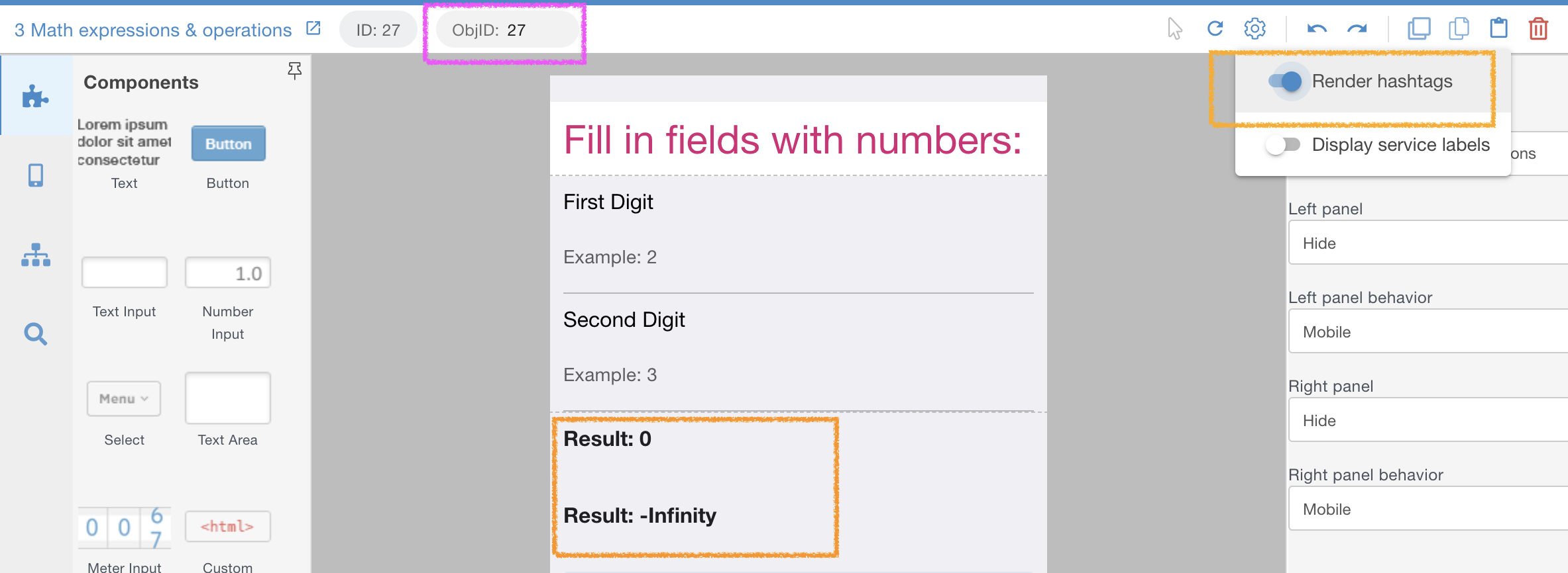
- The data is pulled in hashtags comes from a user IDentified in the magenta block ↑.
- The "Display service labels" function allows seeing which components have hashtags and which are hidden by default.
Note 2 red blocks ↓.
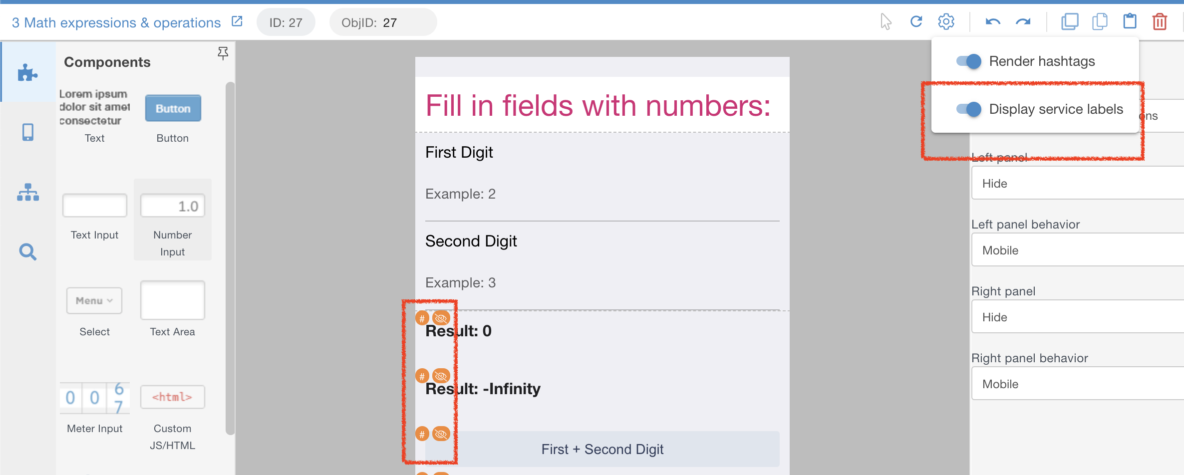
- Point mouse at the hashtag label marked green ↓, and you will see where hashtags are used on this particular component.
In this case - 5 hashtags exist in the Text field of the Properties tab and in Visibility settings: 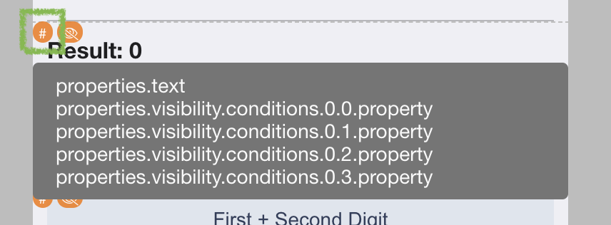
New Drag and Drop quick targeting
- When you place and re-arrange components on the screen it is now easier to select drop location.
- Note the cyan block ↑ above marks the block, where you are targeting the components
and the red-lined block ↑ changes with mouse move to select where to drop, above or below.
You can always use the Components tree in the left panel, for maximum precision of placement, as shown ↓. 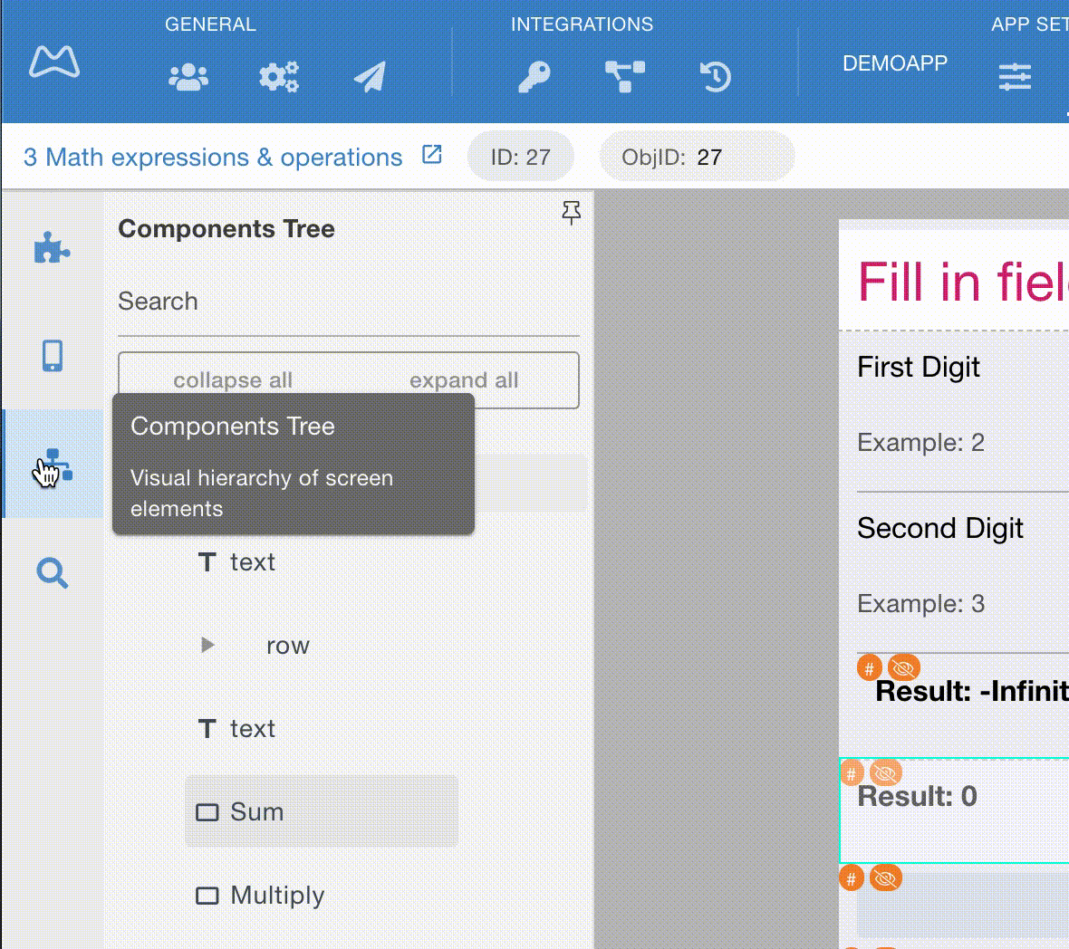
As usual - Looking forward to your questions and comments in the Support channels!