You can make the same app respond to various screen sizes and adapt it's looks and behaviour. This is done by adding standard CSS Breakpoints.
Selecting a screen size to view
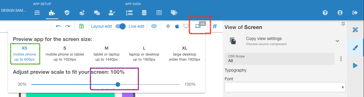
At the screen shot above:
- Press a button to select which screen size to edit (marked Red ↑)
- Select a screen size which you need to PREVIEW
- Marked green ↑ (this is just a PREVIEW pane to see how it will look at each screen size, actual Breakpoints are added on Properties tab of Elements/Components).
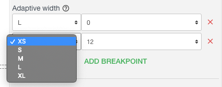
- XS - extra small
- S - small
- M - medium
- L - large
- XL - extra larger
- Adjust preview pane's scale to better fit your screen. Marked purple ↑. This is mostly needed to build for L and XL type of screens.
I M P O R T A N T !!! - THE DEFAULT SETTING IS FROM ZERO px to INFINITY px. So if you do not add any Breakpoints, it will be the same stretched/compressed app for all screen sizes. So for example Adding just one Breakpoint, say "M" will make all screens LESS then M's 1440 be the same, so XS, S & M will have the same appearance. For everything over 1440 it will also be the same. |
|---|
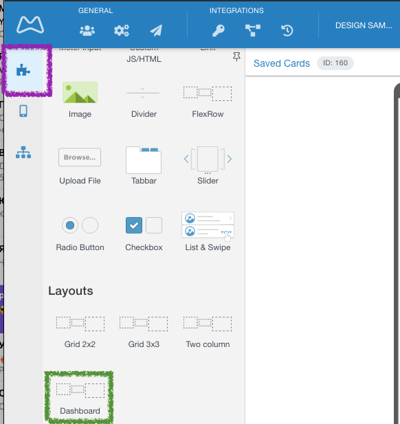
Layout Samples
You can study how the screen responsiveness works you can pull in samples layout called Dashboard (marked Green ↓) from the left menu (marked Purple ↓) and click between screen sizes to see its changing.
.
Changing Width at Breakpoints
The platform uses a standard 12 column grid for all rows. This setting only belongs to a Cell inside of the Flex Row component, as it the container for any other set of components.
Cell is either a Column or a Row within a Flex Row, depending on which span direction is in settings tab for the Flex Row (Row or Column) So to access it open a Flex Row and click a Column (marked orange ↓) and at the Properties tab (marked purple ↓) you will see the Adaptive Width section ( marked green ↓).
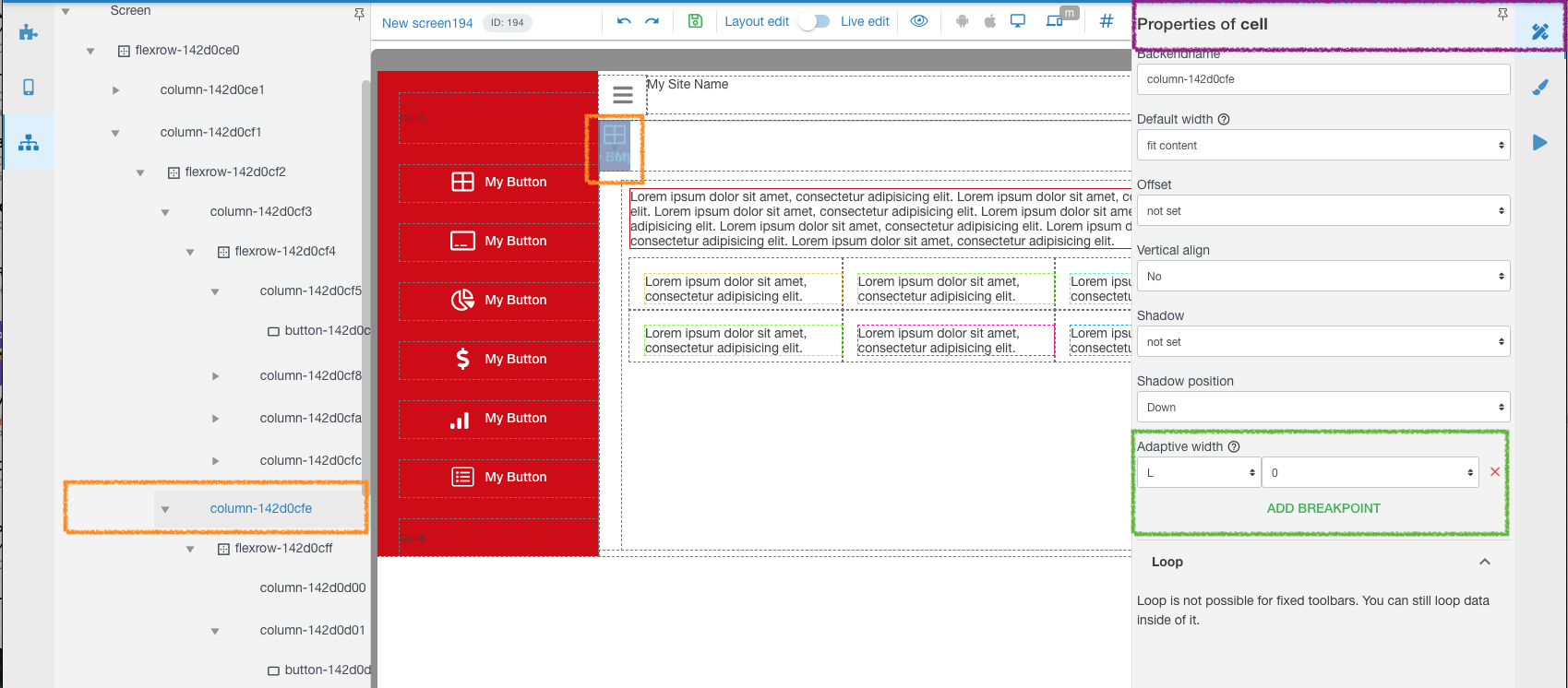
This allows placing needed elements of your application into a needed position on each particular screen size. Or hide Columns/Rows of Flex Row, as in the example above, 0 (zero) means it will have NO width available for this very Column. If we had, say 4, it would mean that Column takes 4/12 or = to 1/3 of the total width available to it. Setting 8 would mean 8/12th or 2/3 of the width and so on.
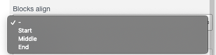
Width is by default cut out of the right side, so the cell will hang to left. This setting can be changed at the Flew Row itself in Settings tab > Blocks align. "Start" is the default one. |
|---|
You can select a Breakpoint and set how many grid cells will be used in it. You can add and delete certain Breakpoints for this very Row - Column.
.
Changing Designs at Breakpoints
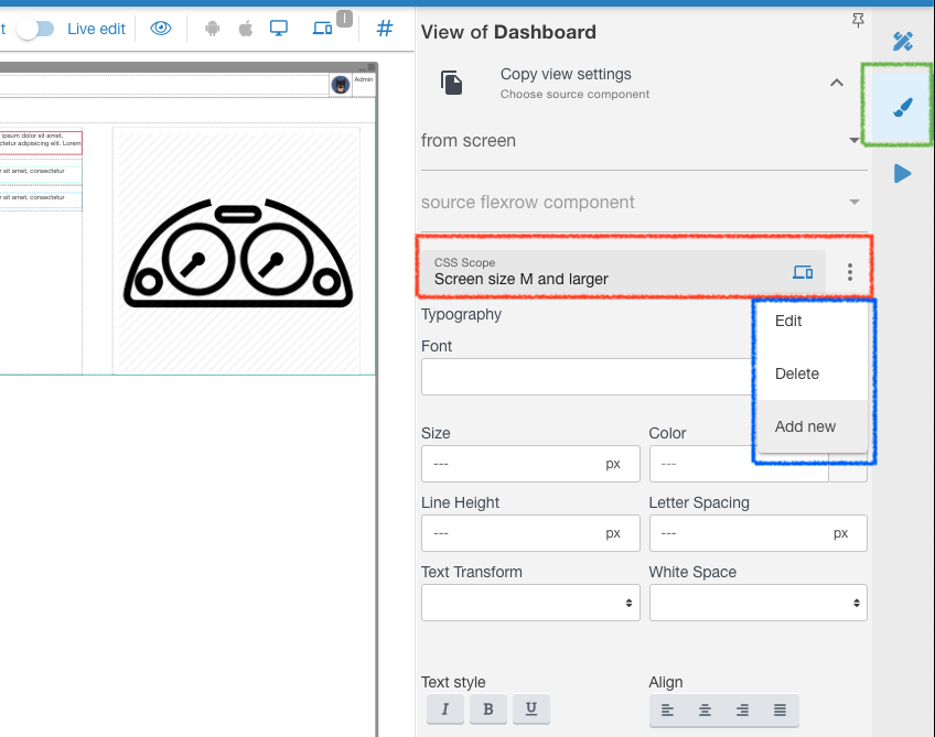
Each of the Components has ability to set looks and design for each type of the screen, to better match UX/UI requirements.
At the View tab (marked green ↓) open CSS Scope block (marked red ↓). You can Add new break points by pressing the menu dots (marked blue ↓), also edit and delete Breakpoints.
Everything you set for a certain Breakpoint on the View tab (Fonts, sizes, colors, margins, etc etc) will ONLY be applied from that screen size and up to the next Breakpoint you set.
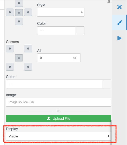
You can also set elements invisible for certain Breakpoints. Allowing you to:
- create different acting elements depending on a screen size
- place same acting elements in different parts of the screen
You just need to set one Component invisible and the other visible, for each Breakpoint:
Related articles