You can add icons to the following Elements - Buttons, Tab Bars, List & Swipes. If you need to add this within any other Constructor Element/Component, you can use a simple button.
For example, in the Sample Design App in your account such icons are used to create the bottom Menu ↓ and the Delete button ↓.

Step 1 - Select an icon you want
Go to the Font Awesome icon catalog and find the one you need - https://fontawesome.com/icons?d=gallery
Select the icon you need and click on the green area ↓ to copy the icon's html class into your PCs buffer.

Note - "acquisitions bla bla bla" is just a name of an opened icon/
Step 2 - Drag and drop an Element you need
Again, this works for Buttons, Tab bars, Lists & Swipes:
Buttons:
At the Properties tab (marked green ↓) select the Icon Class (marked red ↓) and just PASTE your buffer from Step 1 into it.
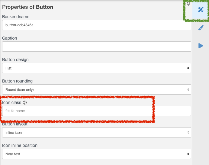
You will see your icon name appear in Properties and the icon itself on the screen.
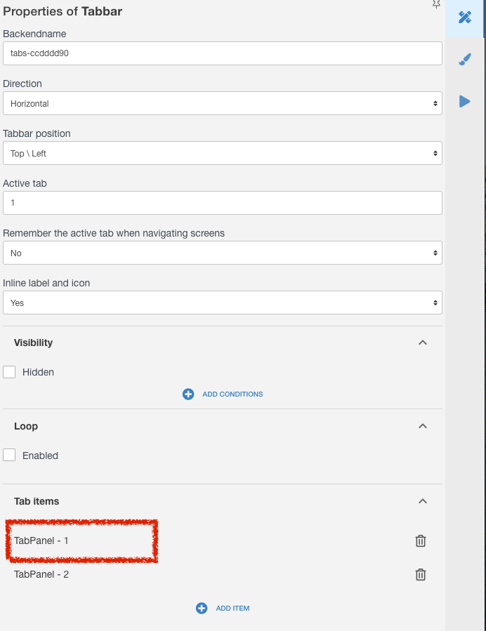
Tab Bars and Lists Swipes:
At the Properties tab click needed element of the Tab or List, marked Red ↓:
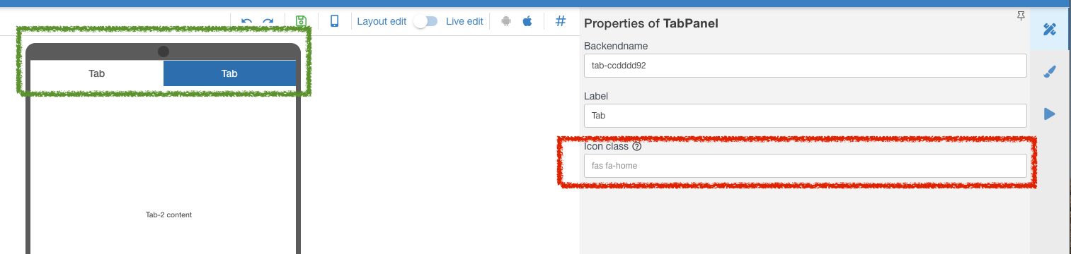
Or you can click the tab itself (marked green ↓)
Now you can add an icon to each tab or list of your element - marked red ↓
Thats all.
Tell us if you need more elements to support this kind of Icons.