| Table of Contents |
|---|
We show how to create this element of any app UI using the mobile footer. The same principle can be applied for other screen sizes and other locations of the menu.
For example, a footer menu in one of the apps fully built on Mobsted:
...
work with Side sliding panels to create various kinds of menus or contextual pages in your application.
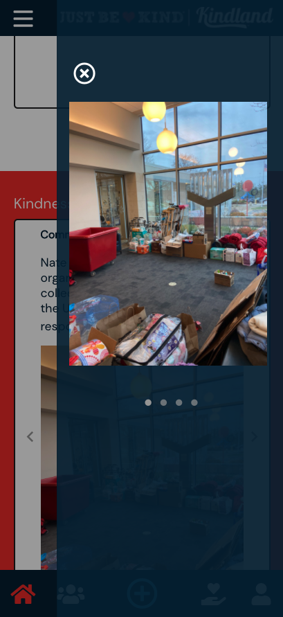
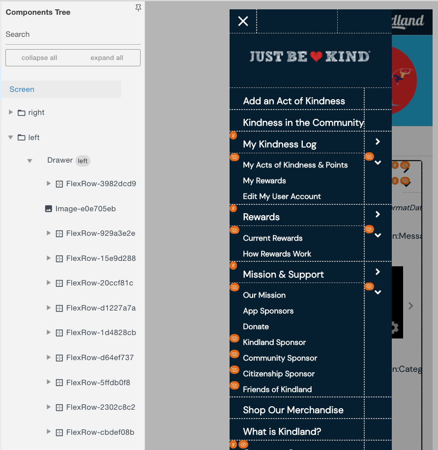
You can see below a left burger type menu and a photo slider made out of sliding side panels in the GoodDeeds application use case, described here. Obviously, you can make it into any design you want.
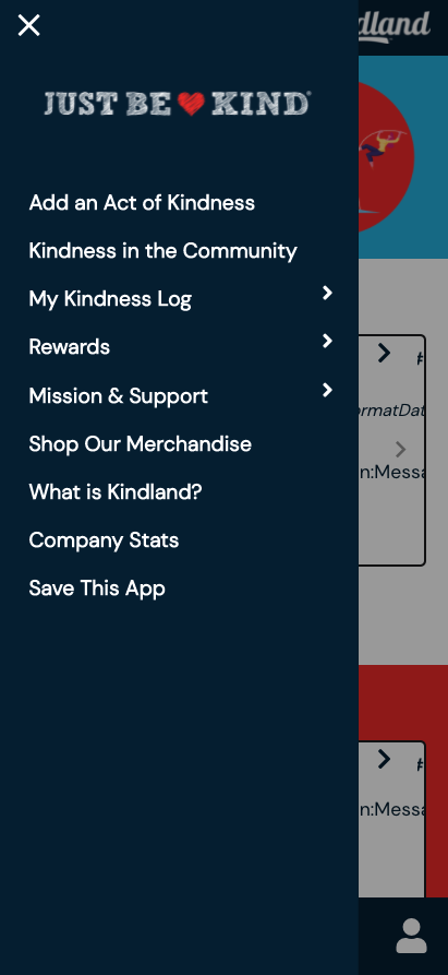
As you can see, the menu can fit most design requirements, can change design or color to show which page you are on, have icons of different sizing.
...
| Widget Connector | ||
|---|---|---|
|
|
Watch a video of how can this be done - or- Follow the steps below:
Step 1 -
...
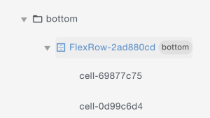
All table-like designs are done using the Flex Row.
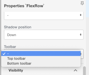
Step 2 - Set FlexRow's Toolbar property
You can choose between top and bottom toolbar locations. In this case, go for the Bottom:
You will see this Property also appear in your Components Tree on the left of Constructor pane:
Step 3 - Add and Edit Columns
Create a needed amount of columns in FlexRow component. Note that cells in a horizontal FlexRow means columns:
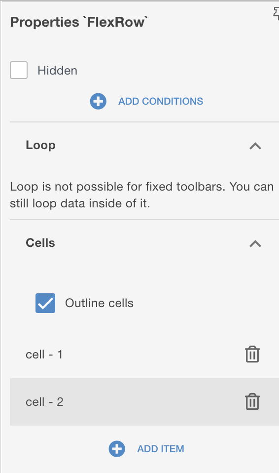
Press + ADD ITEM ↑
You can change the width of any cell - click any CELL to edit CELL's properties:
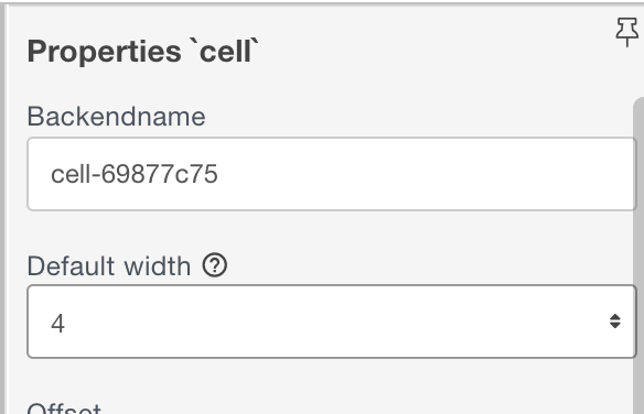
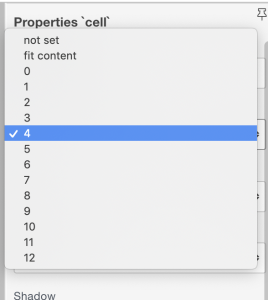
NOTE that Mobsted uses standard 12 column screen width!
...
Activate the side panel
Both left and right side panels are available on the screen. You can see its content in screen's tree panel
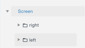
To see the panel visually go to Screen's Properties on you right side
and set visibility to SHOW.
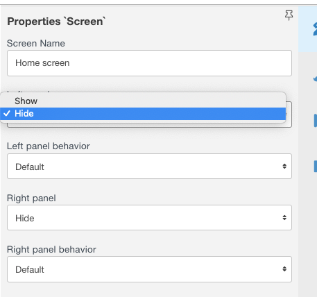
You will see the needed panel slide out and be able to visually edit its content.
Step 2 - Fill in the panel with needed design and actions
Just use all the usual tools to design you panel design and actions.
NOTE - that the sample panel below has SUB-menus, which are easily made by hide and show properties of screen components, as described here.
Step 3 - Add buttons to slide the panel in and out
For example on a sample app, we used a "burger" font Awesome element to open the menu, which you place somewhere in your interface.


and "cross" elements to close the menu, which you place anywhere on the OPENED side panel, as it will enact closing the panel.
Obviously you can choose any design of open/close element as you need to better tell users what is in that panel.
Step 4 - Add
...
OPEN and CLOSE actions to the
...
Drag and drop a button from Left panel to the needed cell, using Tree or directly to the screen.
Step 5 - Change Button's Icon and Design
You can edit any visual properties of the button as with usual buttons
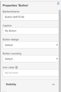
To change an icon, click the "?" as shown below.
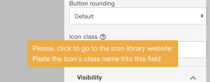
You will see the library with icons. Search by icons meaning there:
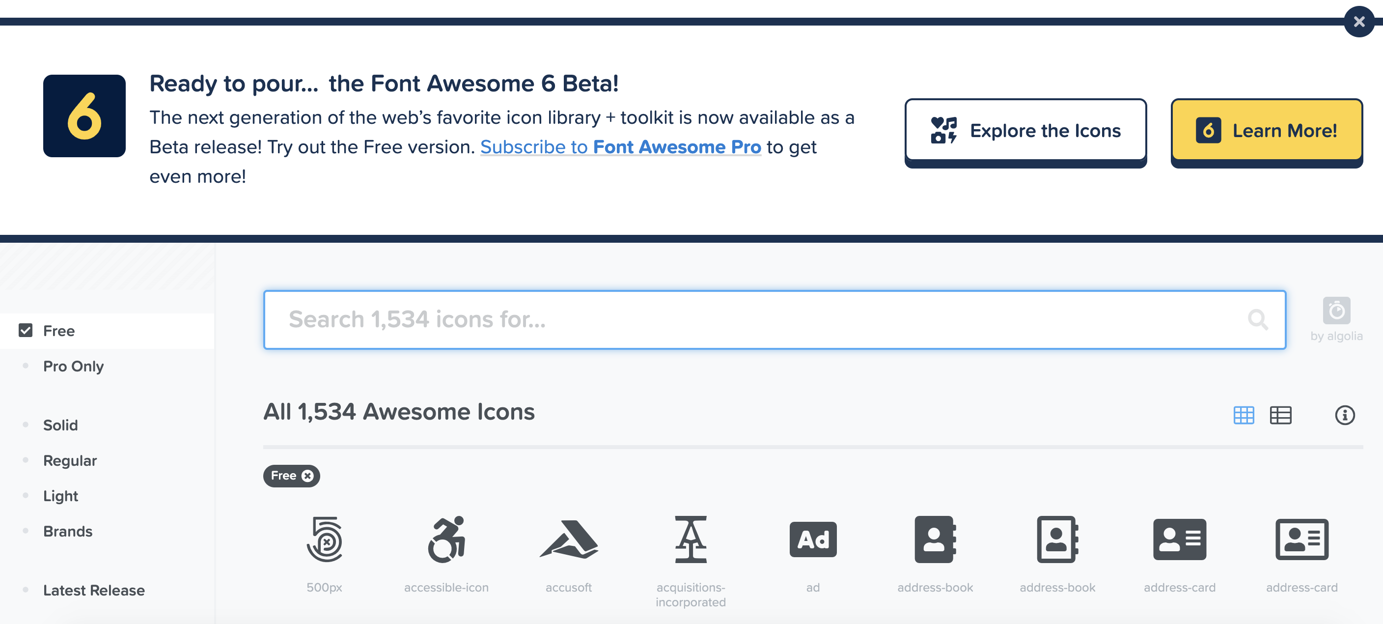
When the right icon is found. Copy it's HTML code:
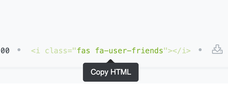
Insert the icon code into the Icon class field, as marked ↓:
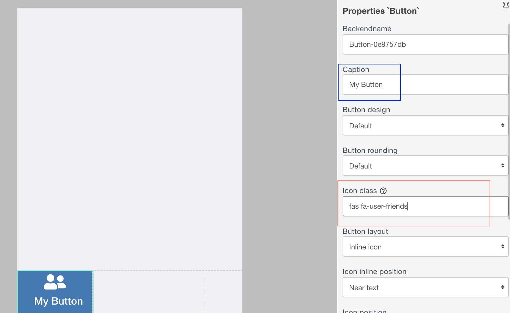
You will see your button change right away. If we want to keep just an icon - clear the Caption field, marked blue ↑.
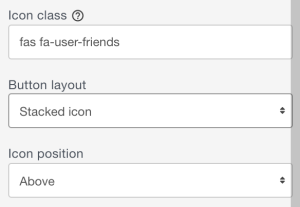
You will also see several new fields below, which you can change based on your needed design:
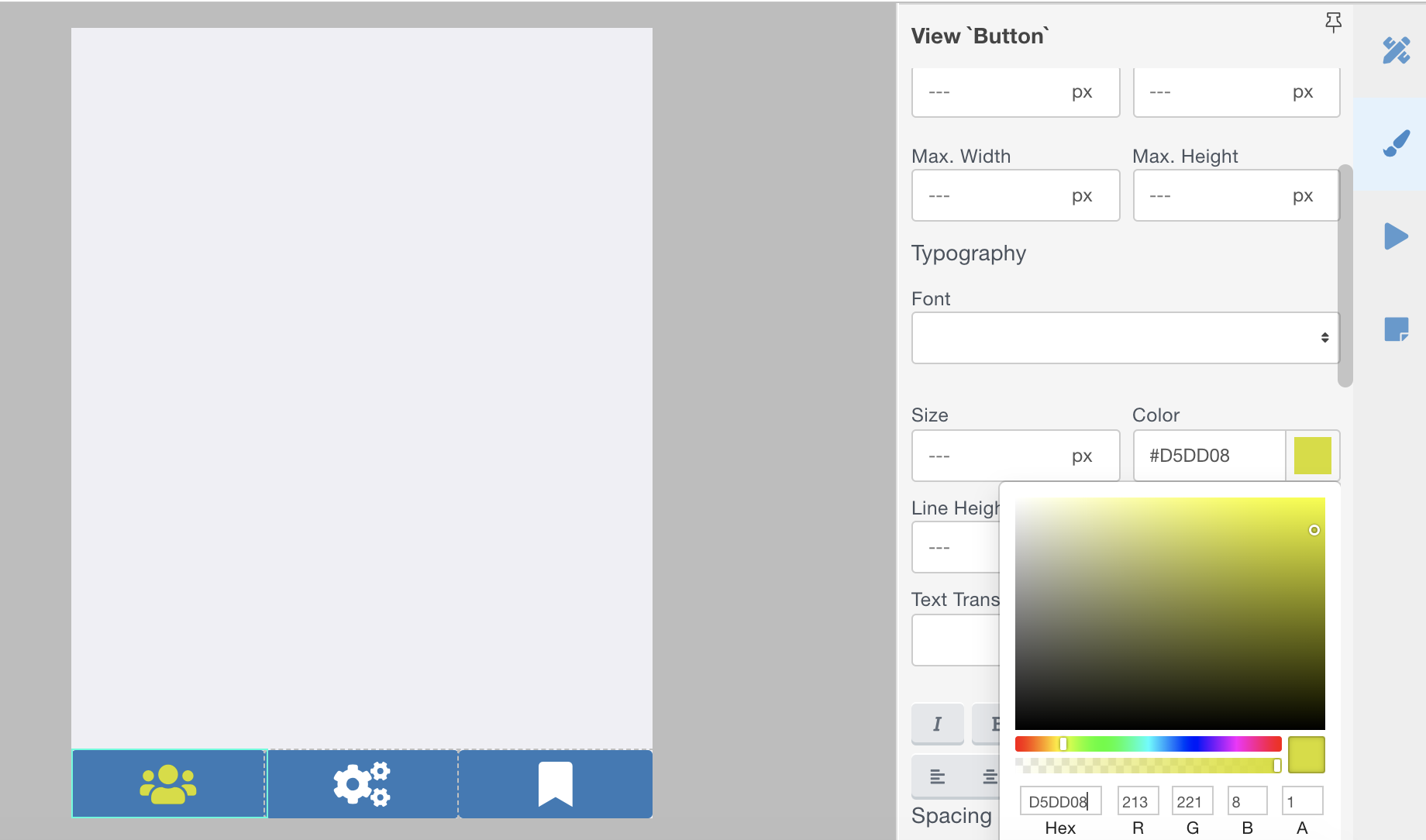
If you want to change the color of the icon, go to the View panel and find in Typography (because the icon is technically a form of a text) and edit Color:
Step 6 - Repeat Steps 4 & 5 for All Cells
Do not forget to add Goto actions, or any other actions, which you need menu buttons to perform.
Step 7 - Use the Same Menu to Other Screens
You can move the same menu to other screens with the same design. Select the FlexRow which contains the menu and "Copy to buffer" then paste it with standard CTRL+V on any other screen.
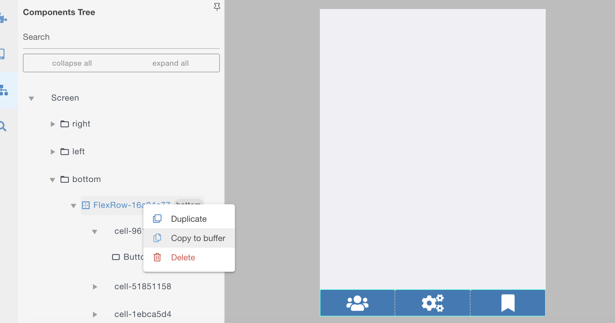
The Copy to Buffer function automatically created a change-protected DESIGN of the copied set, but you can change any parts of it without affecting other pages.
For example, change the color or the icon for the active page, or size of an icon on the active page, or change the number of cells on any page. Etc.
Thats all.
...
buttons
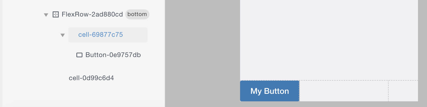
- Select the Button on which panel needs to slide, marked green ↓.
- Open Actions panel and add a standard Action to the button called "Set Component Property", marked orange ↓ :
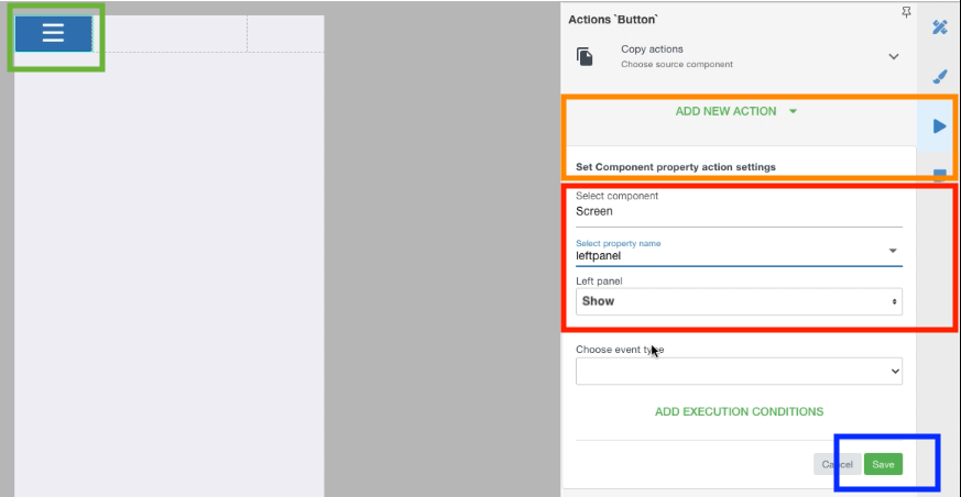
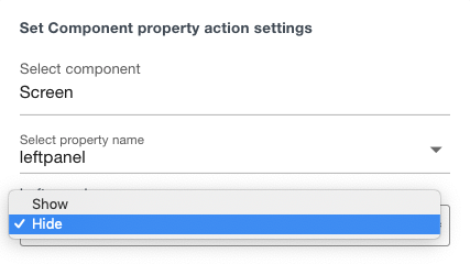
3. Select for which component you want to perform the Action, marked red ↑ - in this case the Screen itself, and then Screen's property for which you perform the Action (left panel in this case), and then set state to SHOW.
4. Save! Marked blue ↑.
5. REPEAT the 1-4 for the CLOSING element in your design, but at the last step set as HIDE:
SAVE THE APP!!!
Now, both of your buttons, burger and cross, will show and hide the left panel on the particular screen.
Step 5 - Placing the same panel on all screens
It is important to remember, that each of your screens CAN have their own panels. This is often needed in logic of some apps.
So you can have different panels on each screen, or you can have the same one on every screen. For this you need to either copy a Drawer (which contains the panel) or just copy a flex row, which contains a full design of your panel (recommended):
1. Select the needed FlexRow and copy it to buffer
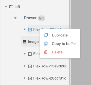
2. Go to the other screen and PASTE it to Drawer in the components tree:
Step 6 - Switch off panel's visibility
Go back to the properties of the screen and set the panel to back to the default "Hide" position.
Save the screen.
Thats all.
Let as know if you need more options in setting up the menusliding panels.